Redesigning the Speax e-commerce experience to improve product clarity, reduce purchase hesitation, and increase conversion.
UX/UI Design
UX Research
User Testing
Design Systems
Product Domain
e-Commerce, Responsive Web
Role
UX/UI Designer
Company
Thinx Inc.
Industry
Health & Wellness, Consumer Products
Impact
Increased conversion rate to 4.32% (+105.7% uplift)
Contributed to $1,024,950 revenue growth across three brands within two months of launch
Improved product clarity and reduced decision friction across PDP and collections
Increased cross-brand discovery through tri-brand navigation (Speax → Thinx +11.99%)
Established a scalable component-based system used across Thinx, Speax, and Thinx Teens
Overview
Speax is absorbent underwear for women managing bladder leaks, a product solving a real need, but in a category shaped by stigma and avoidance.
The original Speax website was designed by a brand and print team. It was visually polished, but structured like a campaign rather than a product experience. It lacked the architecture needed to guide users through an unfamiliar and sensitive purchase decision.
I led the redesign of the Speax ecommerce experience end-to-end, including information architecture, interaction design, and a new component-based system. The goal was to reduce three core barriers identified in research: embarrassment, confusion, and skepticism around product effectiveness and price.
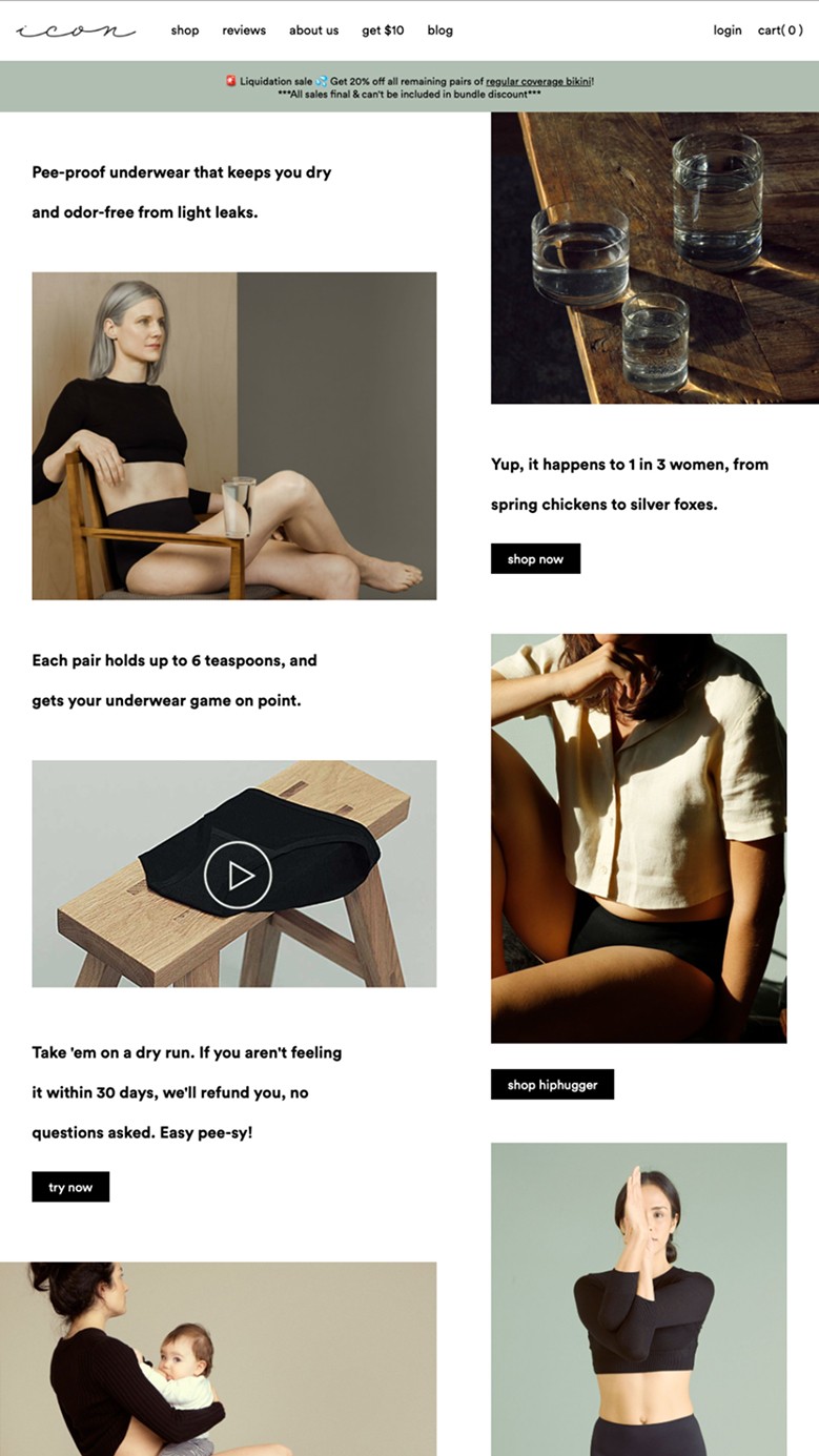
BEFORE (Icon Homepage)
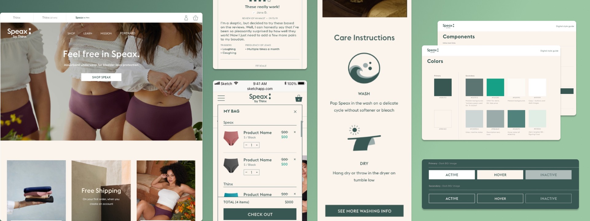
AFTER (Speax Homepage)

My Role
I was the UX designer responsible for UX architecture, interaction design, and execution across the Speax redesign. I translated research findings into flows, wireframes, and final designs, and worked closely with visual designers and developers to bring them to production. I worked within a cross-functional team that included a UX research director (Alyssa Nasca), a UX researcher (Elise Mortensen), visual designers (Kim Suchy and Genna Schwartz), a creative director, and a development team led by Brendan Hastings. I translated research findings into flows, wireframes, and final designs, and worked directly with visual designers and developers to bring them to production.
The Challenge
The existing Speax site was designed brand-first, with product information layered in around photography. While it felt premium, it failed to answer the questions actually blocking purchase.
User testing and analytics were surfacing the same problems repeatedly: users didn't understand the absorbency levels or how styles differed, important product details were buried or inconsistently presented, and the navigation didn't match how users mentally organized the product. But underneath all of that was a more fundamental issue that the data kept pointing to: users were embarrassed. They were researching a product that acknowledged a bodily function they'd rather not think about, and the site wasn't doing anything to make that feel normal, manageable, or cool.
The technical challenge matched the design challenge. The site had been built from PDF and JPEG exports handed to developers. There were no reusable components, no design system, no responsive logic. Every page was essentially a one-off. Redesigning the experience meant building a proper component-based system from scratch at the same time as solving the UX problems.
Research
Our research approach combined multiple methods to understand how users evaluated absorbent underwear, where they got stuck, and what they needed to feel confident purchasing.
The team conducted IA testing (tree tests and card sorts) to evaluate site structure and navigation labeling, moderated usability testing on product pages and purchase flows, surveys and analytics analysis to identify drop-off points, persona and journey workshops to synthesize behavioral patterns, and focus groups in Dallas, Kansas City, New York City, and Los Angeles to evaluate early Speax concepts and messaging.
My role in the research process was participating in synthesis sessions, translating findings into design briefs, and running design-led usability tests on wireframes and prototypes as they developed.


Key Insights
Three insights shaped every design decision that followed.
Insight 1: Users needed permission to have this problem. Many users came to the site already experiencing bladder leaks but hadn't fully acknowledged it to themselves. The site's tone and visual language needed to normalize the experience rather than treat it as a medical condition. The shift from clinical imagery to confident, fashionable lifestyle photography was not a brand vanity choice. It was a conversion decision backed by focus group data.
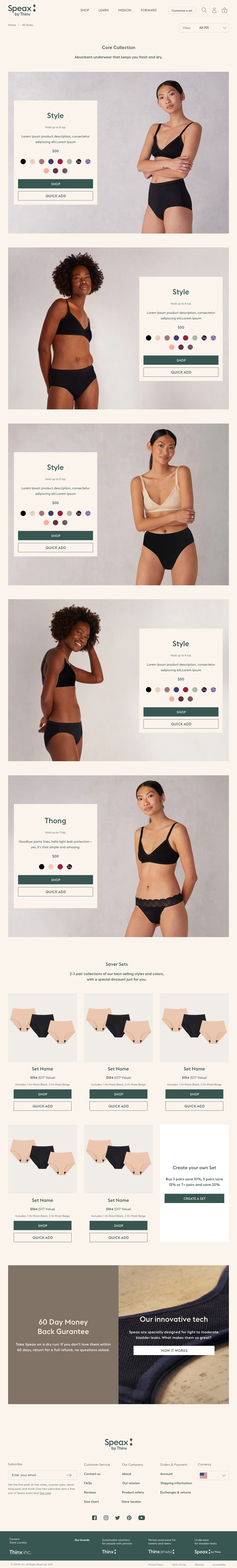
Insight 2: Product differentiation needed to be visible and immediate. Users couldn't distinguish between styles or understand which absorbency level matched their situation. When you can't tell the difference between products, you either buy the wrong thing or you don't buy at all. The redesigned collections page and PDP needed to make those differences scannable and clear before users ever reached a size selector.
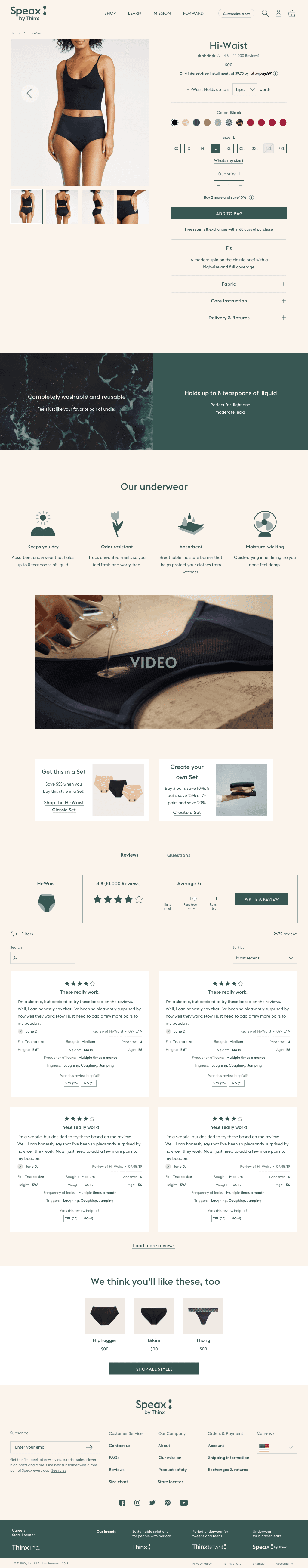
Insight 3: Price anxiety required education, not discounting. At $38 a pair, Speax is significantly more expensive than conventional underwear. Users consistently expressed doubt about whether it would actually work. The answer wasn't to lower the price or run promotions. It was to design a more convincing explanation of the technology, the materials, and what the product actually does, so users felt informed enough to justify the purchase to themselves.

Desktop Mega Nav
Key Design Decisions
Decision 1: Style-first on the collections page, product education on the PDP.
An early version of the collections page led with absorbency information and product benefits. Testing showed that this framing backfired. Users felt immediately confronted with the medical context and disengaged. We restructured the page to lead with style and aesthetic, letting users browse by how the underwear looks and how it fits, exactly the way they'd browse any other underwear brand. The product education moved downstream to the PDP, where users had already opted in to learning more. This sequencing change made the browsing experience feel normal rather than clinical, and the PDP could then do the deeper work of explaining technology and absorbency without it feeling like a medical pamphlet.
Decision 2: Building absorbency education into the PDP rather than a separate page.
The original site had a separate "How It Works" page that explained the technology. Almost no one visited it. We brought that education directly into the PDP, integrated between the product selector and the add-to-cart button, right at the moment of maximum purchase intent. The absorbency visualization, the technology icons (keeps you dry, odor resistant, absorbent, moisture-wicking), and the "How It Works" section with the video weren't supplementary content. They were positioned as essential decision-support at the exact moment users needed reassurance to convert.
Decision 3: Building a component system instead of designing pages.
Because the original site had no reusable components, every design decision had been a one-off. I approached the Speax redesign as a system problem rather than a page problem. Components were designed to be modular and responsive across breakpoints from the start, which meant that design decisions made on the homepage propagated consistently to the collections page, the PDP, and the supporting content pages. This also allowed the same system to be extended to Thinx and Thinx Teens, which is what enabled the broader Thinx Inc. unification and the tri-brand navigation to work as a cohesive experience. The system was built entirely in Figma, with components organized as a shared library file and naming conventions aligned with the Storybook component library used by the development team.
Final Design
The final Speax experience sequenced product discovery, education, and conversion to match how users approached an unfamiliar and sensitive purchase decision.
Collections: Style-first browsing to normalize the experience and reduce stigma
PDP: Integrated education, absorbency explanation, and reassurance at the moment of decision
Conversion: Risk-reduction elements like reviews, fit indicators, and a 60-day guarantee positioned at key decision points


Impact
Conversion rate: 4.32% (+105.7% uplift)
Cross-brand traffic:
Speax → Thinx: 11.99%
Speax → Thinx Teens: 3.47%
Total revenue increase: $1,024,950 across three brands within two months of launch
Speax: +15.9%
Thinx: +14.7%
Thinx Teens: +27.1%
Reflection
The most important thing I learned on this project had nothing to do with interaction patterns or component architecture. It was that the design of the purchase flow is inseparable from the emotional state of the user. Speax customers weren't just evaluating a product. They were deciding whether to acknowledge a personal vulnerability and whether this brand was trustworthy enough to help them with it. Every layout decision, every content hierarchy choice, every visual tone call was either helping or hurting that emotional negotiation.
The thing I'd do differently: I'd push harder earlier to get the "style-first vs. benefits-first" question resolved in research before we started designing the collections page. We went through more iterations there than we needed to because the strategic question hadn't been fully answered when the design work started. Getting that alignment earlier would have saved cycles.